Showing posts with label color visualizer. Show all posts

Sunday, December 21, 2014

Almost There!

Just a day before my parents arrived for their vacation with us we had reached the following stage (of completion):


Also known as "AD" / "Almost Done" we were almost done with painting. Both body colors were up, and all that is left to do is fine-tuning, trim work, and the porch floor.


That will most likely have to wait until after the holidays provided the weather plays along with days that are nice and sunny and not too cold.


The color?
We love it!
We are ecstatic that it turned out almost better than imagined and envisioned here.


Almost there!

After the holidays we will be back with more exterior goodness, but for now, this will have to do (and it does because, omigod, it's so much better than the flaky peeling blue and grey mess from before).


Friday, February 7, 2014

Oh No, You Didn't!

Oh yes, we did.

I know I said that 2013 would be all about getting our Little Old House's exterior spruced up. A whole new color for the ol' gal.

I wrote a detailed email about how we chose our color scheme here and even created some clip art to show everything went together, both on our house and for the big picture aka our blog of the 'hood.

Then this happened - husband finally spoke up that he really didn't like the colors we'd agreed on, and all our plans went, well, to hell in a handbasket. Back to the drawing board it was. After all, the exterior is such a big project that you better 'like' if not 'love' what you put on there since repainting it wasn't going to happen.


We spent weeks painting different shades of blue on the back of our house, until we finally broke down and mixed out own because they all were either too blue, too light, too dark, too grey, too green - well, you get the idea.

Then summer rolled around and all of our plans came to a screeching halt.
Sloshing halt, really, because last year's summer was hot and rainy and miserable.
Mosquitoes grew to the size of helicopters, it was hotter than Hades, and if it wasn't, it sure was pouring buckets whenever we had spare time to actually do paint the house.

The back of our house continued to look like this throughout the remainder of the year. Fall came, and with it nicer weather. It was still wet - wetter than in past years - but there were plenty of nice weekends, just right for painting, and yet.
No painting got done.
We deliberately procrastinated.
No kidding.
I was so not ready to pull the trigger, no matter how much I hated the scruffy look of our little old house.
Then, just a little over a week ago, I caught myself playing with the Sherwin-Williams Color Visualizer, and I realized that while we found a blue we liked, I never quite liked it for our house.

Our little old house just isn't a house that wants to be blue.
History repeating, eh? Now it was my turn with the 'I don't hate it, but ...' spiel.

Before confronting the husband with what had been nagging on my mind for the past months, I kept on playing. I'd recently hit a Craftsman style streak (more on that sometime within the next couple of weeks) and dug deep into the concept of Craftsman style sensibilities. While our house is not a proper Craftsman-style house - its architecture is a bit muddled down - it's a bit Craftsman and Bungalow influenced. We'd already talked about emphasizing rafter tails and such, but playing with the color program I decided to give our little old house a Craftsman make-over, even going so far as to playing with a two-tone color scheme.

And BAM!
That's when I found it: THE color scheme (no, really, this is it).
The moment I painted on the two-tone color scheme on the back of the house (virtually, of course), the architecture of the back of our house where all original features have been lost due to the enclosing of the two small back porches and the second-story addition which now houses our master bath and the dressing room started to make sense again instead of looking bland and faceless!

 I know that it's difficult to understand my excitement over this color scheme when all you have to look at are these pictures. They really could be better ... you know, this one was taken in really rotten weather and it doesn't do anything to prettify the back of our little old house (nor does the stack of wood leaning against the a/c compressor).
 This one - taken and modified online with the color scheme - I snapped to show the husband how the two-tone color scheme would look on the side of our house. He was a bit concerned at first about having a two-tone house in green (a dark sage green/ Sherwin-William's "Oakmoss") and gold (a rich, earthy gold / Sherwin-William's "Bosc Pear") next to a green house and a yellow house, but these colors are very different from the colors of the other two houses so there's nothing to poke fun at.

The real kicker came when I bought two testers with these colors to try them on the house. Nothing is more important than to test your paint on the object of your desire - no, really. Light, sun exposure and shade, and even the texture of your siding make a -huge-  difference in how you perceive your color and how true it will look compared to your paint chip. In all cases prior to this, every color I'd picked required massive ttweaking - going darker, going lighter, going greyer, etc.

These two?
Spot. On.
 And then I discovered this gem in one of my books - a historic craftsman influenced historic house with a two-tone color scheme (green on top) and and off-white/yellow at the bottom. Score!


I'm so stinkin' excited to get started painting I'm rotating on the spot while waiting for an available weekend with good weather!


Friday, December 9, 2011

Exterior Dreaming

As the year is winding down we're gifting ourselves with a little bit of downtime in regards to projects. Naww, we are far from stopping any kind of work but the jobs are smaller, more decorative and contained while we're spending a bigger chunk of our time curled up with a good book, snuggling together watching a movie and just plain enjoying the season (as much as work allows).

It's been 10 1/2 months since we closed on our "Ugly Duckling" and 6 months since we moved in and it's been a whirlwind of home improvement projects ever since. A teeny bit of downtime sure is in order, isn't it?

While we're kind of stationary on the couch, we're happy and eager to plan next year's projects. The biggest one on our list is giving our Ugly Duckling an exterior facelift. It needs it baaaad. The last paint job is failing bad and our house is starting to look like that creepy haunted house at the end of the road. Not to mention we're not too overly crazy about the current depressive blue-grey paint job and dingy blue trim. And the windows need some loving too.

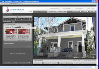
Poking around for inspiration on the 'net, I stumbled across the Sherwin-Williams' color visualizer. Best. new. toy. ever! This fun online tool allows you to upload a picture, define areas to be painted and with the click of your mouse and a drag and a drop you get to "paint" your place in whatever color you dare (and then some)!


You can find the color visualizer here . You need to register first but since that comes with the gift of a $10 off your next purchase coupon, it's worth it. Plus, you get to play with the color visualizer. 'nuff said!


Once you're registered and logged in, you're ready to roll. You can either use a scene provided by Sherwin-Williams or upload your own interior or exterior photo. You then need to "mask" or define the areas you want to paint using a masking tool you might recognize from using Photoshop.


What's really cool is that not only do you get to use -all- of the paint colors by Sherwin-Williams but that they have it neatly organized for you. There are collections by color as well as a collection of historical colors sorted, again, by time period. That's really nifty for us Old House lovers!


Color Collections to choose from


A glimpse of the historical color collections

Here's the Ugly Duckling in its ...ahem, current state (more or less: we have removed the weird handle bar in the middle of the steps, the ugly old awning is gone, mailbox and porch lights have changed and the downstairs window frames were tentatively painted white, just to see what it'd look like)


Our Ugly Duckling is considered a "Vernacular" style house meaning it looks like a typical house of the time and place it was built without following too much of any particular architectural style such as Foursquare, Colonial, Queen Anne, Victorian, etc. It was built in 1914 or 1915 and if you ask me ,it shows a bit of Bungalow flavor with its low-pitched roof and the somewhat prominent eaves. I masked these characteristics to emphasize the architecture through paint. Kind of like putting on make-up.


Playing with the colors from the historical collection, the colors of the Craftman era always seem to work best with their down-to-earth beauty and simplicity.


[Grey doesn't have to look dreary. This is actually pretty sharp looking,


thanks to the crisp contrast of trim to body color]


I especially like it when the front gable is painted a different color than the body. Here I tried some different warm shades of grey and crisp white trim. Yum! Looking so much better!

Don't you love how the color visualizer makes the color change look so natural and real? It's amazing how light and shade are still visible and no detail gets lost. Since you're not using bucket of paints, spending endless hours rolling, brushing or spraying on paint, you can go stir crazy in your color choices to boot!


Here's the Ugly Duckling in daring red and a touch of grey

Sweet and modest in yellow with a bit of brown


Or airy and peaceful in turquoise


Best. Toy. Ever!


So far, I like the turquoise look best on our house but then again I'm usually drawn to blues and greens (case in point: turquoise dining room, teal bedroom, blue-grey bathroom ... you get the idea). What do you think?


We're still in the very very early planning stages of this project. It's going to be a bear of a project - our house is not all that little and has two stories as well and the old paint job is abysmal. I've picked up a couple of DIY books on this topic from the library that make it sound doable even at two-stories, and we're following up on a couple of painter's recommendation from the neighborhood for an estimate to find out just how much we value our sanity.


Pretty-fying the Ugly Duckling on the outside is something I -really- want to do. I want it so much, I'd even consider scaling a ladder taller than my step stool. No kidding.