Showing posts with label dining room. Show all posts

Wednesday, November 19, 2014

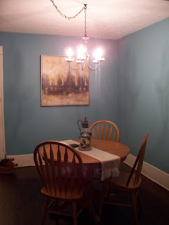
Ding-dong - Dining room done!

I know it's not a lot but staining and polying the table, painting the chairs, and adding shades to the chandelier did give our dining room look a subtle shift to ... well, more craftsman, I want to say, but that's not really true. It's not one of those UH-MAY-ZING blog make-overs. No magazine shoot here either. Maybe that makes it more real?


At the end of the day it looks cozier now which what with the temperatures dropping and Thanksgiving and Christmas just around the corner feels just right.


Sometime these days I'll get started on hanging picture rails and finalizing mural plans. Yes, mural. I want to handpaint a frieze mural. I know I'm crazy.
In any case it will have to wait until the New Year. Right now we're already running around like chicken with their heads cut off. No need to speed up - it's a wild enough ride already!


Monday, November 17, 2014

Dining room Chandelier Make-Over

 The Saga of the refreshing of the dining room look here at the little old house continues with an excursion into lofty heights. Yes, even the chandelier did not get away!

Here is what our dining room looked liked right at the beginning, just 3 years ago. So far we haven't changed much. We added a larger version of our old pedestal table that is more in proportion and keeping with the size of the room than the one we moved in with.
Now the larger dining room table got a mini make over and a new paint scheme.


Now the chandelier. This was an incredible inexpensive find at the Habijax store. Less than $10 for the chandelier, a bit of spray paint to turn the meh glossy brass into oil rubbed Bronze, and those nifty capiz whatchamacallits - done!


Now though I was craving a bit of texture. Seagrass or maybe burlap or something similar.


I did come across a good deal on six burlap mini shades on Amazon, and pulled the trigger!Here they are nicely arranged in a box.


They simply clip onto the light bulb which requires a bit of fine-tuning as you can see since the chandelier comes with chandelier bulbs, and those just aren't straight. You need to rotate the shades slightly, one by one, to account for the twist in the bulb, until they sit straight. Not all cattywampus like in this photo.


The shades dim the light just so to make it look cozy and warm at night while still looking light and airy during the day. I really really like the addition of the shades, even if it means that for some crafts I need to break out the big daylight craft lamp.

I also added a burlap cord cover to our chandelier. It's growing on me although I'm still not quite sold on it. Ergo, the lack of photo evidence. We shall see ....


Friday, November 14, 2014

Dapper Dining

I promised projects and posts and pictures, and you shall have all three!

So, sometime in the last year or so I got bit by the Arts & Crafts bug. No, not the DIY kind of bug but the Craftsman style design movement of the 1900s. The Arts and Crafts movement was an international design movement that flourished between 1880 and 1910, especially in the second half of that period, continuing its influence until the 1930s. It stood for traditional craftsmanship using simple forms and often applied medieval, romantic or folk styles of decoration. Colors were earthy, craftsmanship impeccable, decorating non-frilly and simple. To me it is best summed up as "Hobbit House Style." If you consider Bilbo Baggins' cozy abode as seen in the movies "Lord of the Rings" and "The Hobbit" the perfect home, you might be a candidate for the Arts & Crafts style.

Our house was built in 1914, toward the tail end of the Arts & Crafts movement, and while it's not a stereotypical example of arts & crafts architecture, it does feature some elements that hint at it like dominant brackets bearing the roof, exposed rafter tails, and more. And I really really love Bilbo Baggins' home. So much that it suckered me right into the Arts & Crafts design boards on Pinterest. While I'm not willing to go back and strip all of the freshly painted white trim work inside my little old house, I have slowly begun to add Arts & Crafts touches to our house. More on that in days to come!

A simple and much quicker Arts & Crafts update to our beloved dining room was to refresh our dining room set. Because, you know, I didn't have any other, more pressing projects lined up four weeks before my parents' visit.


Here is our dining room set pictured with two of the available furry supervisors: Athena, the cat, and Roomba, our foster pup. Everybody else didn't make it into the shot - too slow! The photo isn't great - the table isn't bright orange, I swear! - but you have seen this table and chair set before. It's a plain honey oak color - nothing to write home about.


In order to tie everything together I decided on a two-tone color scheme for the table with the pedestal in white and a stained top. A quick sanding and priming ensured the paint would stick and stand up to occasional misplaced kicks under the table.
Here, another supervisor joins the crowd - Turtle, the tortoise kitten. She came to us as a foster kitten through the local animal shelter as a two week old bottle baby, and while she eats for two, she has a hard time growing. She just now, after four months, finally made it past the two pound mark required for surgery (she needs to be spayed before she can go out for adoption). She's stinking cute but somewhat weird. She likes to watch and observe a lot, teeny head cocked a bit sideways, looking slightly bewildered.


My furry supervisors got bored after a while and wandered off to take a nap giving me free reign and a paw- and furless working environment. That was really essential for staining the top. I went with General Finished Gel Stain in Candlelit (get it here, for example) after reading plenty of sites and reviews on the ease of using it on other typical blonde honey oak cabinets. Most seem to use Java but I didn't want to go that dark.


It's nowhere near as red as it appears here. It's a warm, almost mahogany type of brown, very rich and 'glowy.' I loved working with the gel stain which went on smoothly and evenly without the need for wood conditioners, massive sanding, and more, like with usual wood stains.I had bought a quart of General Finishes Poly in Satin to seal the top, and working with that was just as easy. Three coats and the top is super silky smooth, and looks terrific!


After finishing the table I debated what to do with the chairs. Two-tone looks for them? Stain only? Both, Big Man and Little Man, vetoed these and suggested black chairs.
I wasn't 100% sold on the idea but forged ahead, and what can I say? My men were right - The black chairs work great with the two tone table!

After painting the chairs black, I sanded the edges a bit for an aged look and used the gel stain as a glaze - lovely!

Saturday, July 16, 2011

Dining room impressions

You know how they say it's bad to play favorites? I just can't help it - right now I do think the ding room is my favorite spot in the house. See what I mean?


[Dining room at dusk]

No worries, our sweet neighbor can't peek into our house from her window - or at least she doesn't - what with the privacy film on all of her windows.

The vintage dresser we scored at the local ReStore fit perfectly into the spot between the two windows and so I moved it there and I'm thrilled by the amount of storage it provides. Paper, homework and cub scout supplies only take up the bottom drawer, for example.

I unearthed another one of husband's vintage type writers - this one's an "Underwood", so I generally refer to it by the name "Carrie" ..heh - and gave it a seat of honor next to the old brass lamp I scored at the Goodwill Pound Store for just $2. It needs a different shade, one that actually has the right size, but for now it works quite nicely, don't you think?


Ahhh, love!

Friday, July 15, 2011

Curtain Call at the Dinner Theater

While husband is doing all the hard physical labor when I can't help, I get to be useful in other areas of the house. As the dining room is in direct line of sight from the living room, it's one of the rooms that has been really on my mind and my to-do-list lately. The one thing that really makes a room look like an actual room and less of a construction zone are curtains.

Just finding the right curtains to go with our lovely "Lyndhurst Duchess Blue" turned out to be a bit more difficult than I'd expected.


[Before: Our reading nook in the dining room]

What? You don't have a reading nook in your dining room? Man, you should try it, it's really neat. Not like we'd planned one, its just where the rocking chair ended up when we dumped all of our belongings into the house and we really like it there. It also adds another function to our dining room and that's always a good thing, in my book at least.

After looking in all the usual places, it's Target to the rescue!

[Another lucky find: Dwell table cloth from Target]

Yes, it's a table cloth but the color scheme and design were just what I'd envisioned all along. I ordered two and since they measured 60x104 they were plenty long and just wide enough to be cut in half for a curtain panel on either side of each of the two windows. Score!

[Hemming the panels. Funny how the paint on my hands is a dead give-away that I tend to project-hop]

I rarely pin. I simply pinch and fold and run it through the machine. I have tried those no-sew iron on hem tapes before and frankly, they suck. Or maybe I've been using the wrong brand, who knows ...


[Folded over no-sew treatment]

Since the panels were longer than I needed, I decided to fold the top over for a little fun treatment at the top. That way it looks more like a curtain and less than a home-made concoction from a table cloth. Since no sewing and no cutting was involved I get to buy some time before deciding whether to use the excess fabric for pillow covers maybe.

Just like before I used curtain clip rings. You can find them at the blue box and places like Big Lots for just $5 for a pack of 14.


[Close-up of the folded top edge]


[Closed curtains]

Two panels are still wide enough to cover the entire window for privacy at night if we feel the need.


[After: All finished]

I'm tickled pink about these curtains. The fabric is simply perfect! The white keeps it fresh and the dabs of blue and yellow play off of the colors in the room beautifully without being overwhelming.

Notice something else?
The dresser formerly earmarked as vanity for our master bathroom moved into the dining room. How much better could it possibly get? Squeeeee!

Monday, July 11, 2011

Lighting Love

I have a confession to make: Of all the unfinished rooms here at the Duckling, the diningroom is starting to turn into my most favorite. See?


The baseboards and the window frames still need painting, there are no window treatments and so far the Gods of Craigslist haven't shown any mercy in my quest for a buffet or credenza but things are looking UP in the dining room (and we're obviously on a roll in the lighting department).

Up!
See the chandelier?
I'm loving it!
Come a little closer ...


Not bad, eh?
See those little petal-styled dishes?


Just like the chandelier which used to be an awful brassy yellow, those little capiz petal dishes were lucky finds at the local ReStore. I picked up a couple of extras, just in case, and got 10 of these darling little things (What do you call them? Do they have a name?) for a whooping $5. Which was what I paid for the chandelier a few weeks ago.


And for $7.50 and some change (for spray paint, a hook and some extra chain) we have a lovely and unique chandelier! What's your latest steal of a deal?

Saturday, April 9, 2011

The best laid schemes of mice and men

The best laid schemes of mice and men go oft awry ...
- Robert Burns-

Just like the livingroom went through a design modification, things didn't go quite as originally planned with the adjacent diningroom. This is the design board from waaaay back in November, I believe, when we were muddling over color choices and design ideas as a way to pass the time until closing.
[Original design board for the diningroom]

Toasty brown and warm ...and maybe a little boring. Right? I didn't know what but something was missing. Not like I could put my finger on it, oh no, it was merely a gut feeling that this wasn't really it .. or us. Then I came across this color

[source: Valspar]

Lyndhurst Duchess Blue. My Lord, it's so pretty! And the diningroom pictured painted this color in the Valspar brochure just kept yelling at me: "Pick me! Pick me! Pick ...." Yeah, I get it. It was a hard sell but by God (and with a lot of His help, I suppose) I sold it to the husband. Last weekend we did the deed. Wearing my big girl pants, all giddy with excitement over this beautiful dusty aqua color we started painting over this room's swine-ish glory

[Before: Ahh, the floors, those beautiful floors! They make
even "swine" look good]


Oh boy! The moment the paint went up I could feel myself shrinking in my big girl pants. Boy, it was bright! And aqua! And colorful! Dear husband was gracious enough to wait until coat no. 1 was finished before coming to a final verdict. Frankly, I was convinced we'd made our second bad color choice and needed to rethink our strategy for the diningroom, but I grit my teeth and painted away.

And after all the swine was gone, the magic happened. This dusty greenish aqua is the most gorgeous color. It's bright, but it's not overwhelming you. It's cheerful, yet soothing. It's colorful, but not overbearing harmonizing with the colors around it beautifully.

[After: Helloooo pretty!]

It's fabulous and we both love it a lot. Even the little man thinks it's a cool color. I think this was our boldest move color-wise and it took us quite a bit out of our usual comfort zone but it was so worth it.
[Catching a glimpse from the living room]

Guess I should make up a new design board, yes?