Saturday, July 30, 2011

Bella Galleria

Even though most of our house looks like an exploded construction site, I can't help but forget about the buckets of paint and the drywall dust everywhere and simply go a-decorating! Sometimes, the decoration is triggered by a need for a solution to an ongoing ....hm, problem.

See, there's our stair case. It's now bright and open and one of the main traffic arteries of our house. Despite the fact that there is a handrail, a certain member of our family likes to use the wall on the right for additional support leaving hand prints in his wake. "Hands off the walls!" is a shout that rings through the Duckling on a fairly regular basis, yet, to no avail.

[Before: Bright airy but empty staircase]

A barrier was needed ... and quick! I gathered all the decorative frames and plaques I could find, grabbed my trusted spraypaint and went to work!


[Letters and ceramic plaque got a new coat
of paint]

[Pile of frames and art and more!]

Gallery walls have been all the rage in the blog world but frankly aside from a more contemporary styling, picture walls have always been a staple in the decoration of a family's home.

[Testing the layout]

There are plenty of posts out there all giving you plenty of detail on how others planned and laid out their gallery wall. I simply played with the frames and other objects I had, nudging them around and re-arranging them on the floor until I had an arrangement that looked like it'd work well on our staircase's wall.
And rather than cutting pieces of newspaper or cardboard to size and placing them on the wall first, I eyeballed where the center of my layout should go, grabbed the frame in the center of the layout and pounded in a nail. From there, I used the center frame as orientation point for the following pieces, and about half an hour later our staircase looked like this:


[After: A whole wall of pretty pictures!]

Loooooove!

Only regret: I started a little high(er) than I feel I should have. I usually tend to hang frames a little on the low side, so I aimed a little higher this time. What we'll need is simply more pieces of art and pictures to extend the gallery wall to the lower half of the wall. And even though the frames do not cover the target zone for hand prints, they do their job in deterring pawing the wall on the way up. Gallery wall for the win!

[Peering up the stairs]

Yep, we're definitely off to a good start here

Thursday, July 28, 2011

Master Bathroom - the story begins

With the wooshing sound of a deadline fast approaching, these DIY newbies have been busting their behinds to whip up a master bathroom in what is generally considered "no time" aka four weeks.


Yeah, you read that right. An entire bathroom in four weeks.


Well, make that four weekends since both of us work for a living since nobody is paying me for spraypainting or spending time on pinterest just yet. Working on DIY projects every single day of the week has surprisingly lost its novelty. Considering the miles of trim I wanted to have painted by and that still needs painting, I feel so overwhelmed that I need to take a break before even getting started. It also doesn't help that by now we have thoroughly learned the lesson that nothing gets ever done in as little time as you 'think' it'll take. Nuh-uh, it'll take at least twice the amount of time you alloted and four times the amount of time you ever wished to spend on this project.


Enough whining - whining and no pictures make this a very un-fun post but I'm working on the picture part so bear with me for now. You see, my husband gifted me a sweet new camera for my birthday and I just need some time to install the software to download the pictures I took of the master bath in progress, the vanity in progress and the anti-smudgey-handprint protection project in progress.


Three weeks ago husband and I trekked over to the boxstore and came back with the foundation for our tile floor:

- Hardy Backerboard
- Ultraflex Thinset
- Cement board screws
- Seam tape
- a notched trowel
- and most importantly soft-cushiony knee pads.

We'd interrogated our lovely contractors while they were still working on our Duckling house on how to best approach the flooring in our master bath upstairs and so we kind of knew what we were supposed to do. I found this nifty drawing that really boils it down to the essentials.

Wooden houses and their plywood sublfoors tend to be a bit on the flexible side of things which generally doesn't mesh so well with something as rigid as tile floors. We used Ultraflex Thinset for both cememnt backerboard and tile to add an additional flexible component to help ease the transition from flexible subfloor to rigid tile.


One entire Sunday was spent - on our knees, well, mostly the husband on his - buttering our plywood subfloor with thinset, laying backerboard and screwing the backerboards in with backerboard screws [And as soon as I figure out how to get my pictures off of my new camera, I can show you what it looks like] making sure to stay nicely even and level. After mudding and taping the seams between the individual boards (and drying), our floor was ready for tile!


We were rather thrilled how easy the hardi backerboard was to work with. It comes with a handy-dandy incised grid that makes cutting so easy and circular notches to help you get the spacing for your screws right that we think it might have been produced with the unsuspecting DIYer in mind :o) It certainly worked for us!


Next step: Tile!

Sunday, July 24, 2011

Love at first sight

Hello!
My name is Micha and I'm a member of Antiques Anonymous. Vintage furniture and household items have always held a great fascination for me, and it's been a hard habit to break. Marrying a dashing writer who collects vintage typewriters and loves tweed hats as well as buying an almost 100 year old house in a historic neighborhood cannot be recommended as a cure.

It don't work, man :o)

So I'm sticking with my bad habit and playing it up a notch by introducing our latest lucky find aka the bathroom vanity!


[Another bad habit: I hardly ever stage photos]

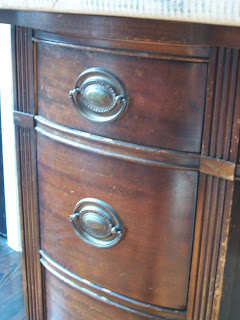
I discovered this lovely lovely Drexel kneehole desk at a local thriftstore and went into an ecstatic seizure the moment I spotted it.
The curvy front!
The ring pull hardware!
The detail!


[Lovely vintage brass ring pulls and carved detail]


[Beautiful decorative detail on center drawer]


I called the husband who promised me to check it out with me the next day (we have this agreement that bigger items need spousal approval to make sure we both love it; for smaller things I reign supreme and so far there're no complaints from the husband). I was hopeful it'd still be there the next day and 'lo and behold, it still was, along with it's $50 pricetag and an extra sticker that said it was now 25% discounted!


Cue: Fireworks!


Needless to say that the husband loved it just as much (albeit a bit more dignified) and this lovely baby went home with us. (It's amazing what you can strap to the roof of the Jeep, seriously!).


Finding the right piece of furniture for a one of a kind vanity with vintage flair took the better of 6 months. Most -dressers- are too tall and too narrow; if you've just started looking, skip the dressers and look for credenzas, buffets, servers and writing desks instead. Good luck!

Saturday, July 23, 2011

We got tile!

Husband and I have been on a mad shopping spree this past week trying to acquire the last big ticket items to finish up the main projects as much as possible (aka master bathroom and the guest bedroom).


Originally we'd mused about using black penny tile for our master bathroom. Small mosaic tile floors are historically accurate tile choices for bathrooms in houses like the Ugly Duckling and we really really like them. Using black rather than the historic white would have given it a slight contemporary twist and of course provided a fantastic backdrop for my lovely lovely clawfoot tub.


[via Pinterest]

Sharp looking, isn't it? We held on to that idea until one day when we're nosing through the box store and discovered a huge 18x18 dark grey tile named "Fume". We were smitten (and not only because it reminded me of a childhood cartoon about a little Dragon "Grisu" who wants to become a firefighter ... his Dad's name is Fume)


[source: Lowes]


Lovely ...and a lot more budget-friendly which is always appreciated. We were -this- close to putting in our order for a whole truckload of "Fume" when we walked past the vintage mosaic tile again, and all our well-formulated plans went out the window again.


[The winner!]

Love. It.
The contrast between the glossy black tiles and matte white tiles tickles me pink. This weekend, the tile will be going in so I really need to get started on sprucing up the vanity ... and we need a mirror. And towel rings and and and ...

Does the shopping ever end?

Friday, July 22, 2011

Little piece of jungle

Yes, there's a tight deadline for the completion of our Masterbathroom, the dressing room and the guest bedroom.
As in, we have 2.5 weeks left.
Super tight.
I just can't help it - I need to dig in the dirt every so often!!!

So last weekend, I grabbed my Little Man and after a mad and quick shopping spree at the blue box and coming home with a Jeep-load of plants we tackled the first spot in the back yard. I've mused about our grand plans for our ittibitty backyard haven before (read about it here) and it was about time to take the first steps in turning our patch o'weeds into our tropical retreat.


[Before: At least it's green]


With the exception of the beautiful shade provided by a humongous holly tree and a hint of color from a young and skinny crape myrtle, our backyard is more or less just weeds. Big yawn. The fence is still waiting for the trumpet vine I planted weeks ago to grow tall enough to cover it and we still need to bump out that angled side to follow our actual property line. Some day, some day ... gotta save a few projects for later, right?


[Lovely loot!]


Little Man and I picked up a few tropical staples and for less than $100 we came home with 2 beautiful canna lilies, 3 spider lilies, 2 palm trees, a tray of pentas, a red mandevilla vine, the coolest purple plants EVER, and two different kinds of potatoe vine for easy coverage.


[Placing plants]


We dug up weeds, tilled the soil, worked in some manure and then finally started experimenting with the placement of our plants.


[It's good to have a little helper who doesn't mind getting dirty]


We mulched with pine straw, watered and stood back to admire our work.


[After: Greener, more colorful and a lot more to look at]


There you have it, a first glimpse of things to come in the backyard. We're loving it and dishwashing has improved mightily thanks to a much improved vista from the kitchen window. We still got a long way to grow ... heh ... but at least we're on our way.

Thursday, July 21, 2011

The eagle has landed!

Don't you love it when the Fedex or UPS truck pulls up in front of your house? We've had the same UPS driver for the past 7 years, and we're pretty friendly with each other. The Fedex truck we see less often, so there's no personal relationship just yet but the excitement was all the same when it stopped and the driver got out carrying a large box!

[Ohh, the suspense! Eeet ees killing meee ...]

I don't know about you but if it's a package at work, I pull open the little clear plastic pouch for the packing slip first. If it's personal, I can't hold back and tear right into the box and the packing slip can wait. Expecting a sink and a faucet - two items that tend to get packed in rather large boxes with plenty of stuffing material - I was curious which eagle had landed first.

Woot! It's our sink!

[My precious ....!]

Guess I better get going on refinishing the dresser we have found for our vanity, hm?

Tuesday, July 19, 2011

In Transit

Work on our master bathroom has finally begun in earnest. We have a 4 week plan and are still hopeful to finish it (mostly) in time for my parents' arrival on August 8. You know, so we have 2 full bathrooms and a half bathroom to share between 4 adults and two kids for 3 weeks.

Before I show you what's been going on in the room itself, I thought I'd share the fixtures that the husband and I settled on. Sounds good?

Rather than go for two smaller vessel sinks we decided to go big(ger) and create a focal point with one single, larger vessel sink in the center of the vintage dresser. I mean, if I can't share with my husband, there's definitely something foul in the state of Denma-... I mean, our marriage. Yes, I know, HGTV always runneth over with praise over his and her sinks, but personally we think it'll be a better use of the space visually than creating a rather crammed and awkward double sink setting. We also don't mind sharing, really. We've done so for the past 8 years now with no detrimental effects to our sanity, and are looking forward to the next 8.

[source: Amazon.com]

Here's our pretty vessel sink. It's oval, measures 15" across and 23" wide, taking up half of the surface of the vintage dresser we found for it. After browsing various places, both online as well as real retail stores, we scored this steal of a deal on Amazon.com.

Next is the faucet. This one was much harder to find. Since our clawfoot tub came complete with a vintage looking chrome faucet, we had to try and match at least the finish if not the vintage looks. There are very very few vessel sink faucets that can be called "vintage looking" that are also within our budget. Sure, I could splurge on a $500 faucet but who's going to buy an almost 8-year-old firstborn, hmmm?

[source: Amazon.com]

Again, Amazon.com came to the rescue! It meets all our criteria and the reviews were all positive, so it went into the shopping cart.

So far, so good. After shopping and paying for these babies last Thursday, I received the shipping confirmation Friday morning! They are scheduled for arrival on Monday, so stay tuned!

Update:
Guess what just arrived? My sink is here :o) Woot!

Saturday, July 16, 2011

Dining room impressions

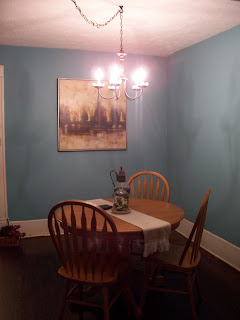
You know how they say it's bad to play favorites? I just can't help it - right now I do think the ding room is my favorite spot in the house. See what I mean?


[Dining room at dusk]

No worries, our sweet neighbor can't peek into our house from her window - or at least she doesn't - what with the privacy film on all of her windows.

The vintage dresser we scored at the local ReStore fit perfectly into the spot between the two windows and so I moved it there and I'm thrilled by the amount of storage it provides. Paper, homework and cub scout supplies only take up the bottom drawer, for example.

I unearthed another one of husband's vintage type writers - this one's an "Underwood", so I generally refer to it by the name "Carrie" ..heh - and gave it a seat of honor next to the old brass lamp I scored at the Goodwill Pound Store for just $2. It needs a different shade, one that actually has the right size, but for now it works quite nicely, don't you think?


Ahhh, love!

Friday, July 15, 2011

Curtain Call at the Dinner Theater

While husband is doing all the hard physical labor when I can't help, I get to be useful in other areas of the house. As the dining room is in direct line of sight from the living room, it's one of the rooms that has been really on my mind and my to-do-list lately. The one thing that really makes a room look like an actual room and less of a construction zone are curtains.

Just finding the right curtains to go with our lovely "Lyndhurst Duchess Blue" turned out to be a bit more difficult than I'd expected.


[Before: Our reading nook in the dining room]

What? You don't have a reading nook in your dining room? Man, you should try it, it's really neat. Not like we'd planned one, its just where the rocking chair ended up when we dumped all of our belongings into the house and we really like it there. It also adds another function to our dining room and that's always a good thing, in my book at least.

After looking in all the usual places, it's Target to the rescue!

[Another lucky find: Dwell table cloth from Target]

Yes, it's a table cloth but the color scheme and design were just what I'd envisioned all along. I ordered two and since they measured 60x104 they were plenty long and just wide enough to be cut in half for a curtain panel on either side of each of the two windows. Score!

[Hemming the panels. Funny how the paint on my hands is a dead give-away that I tend to project-hop]

I rarely pin. I simply pinch and fold and run it through the machine. I have tried those no-sew iron on hem tapes before and frankly, they suck. Or maybe I've been using the wrong brand, who knows ...


[Folded over no-sew treatment]

Since the panels were longer than I needed, I decided to fold the top over for a little fun treatment at the top. That way it looks more like a curtain and less than a home-made concoction from a table cloth. Since no sewing and no cutting was involved I get to buy some time before deciding whether to use the excess fabric for pillow covers maybe.

Just like before I used curtain clip rings. You can find them at the blue box and places like Big Lots for just $5 for a pack of 14.


[Close-up of the folded top edge]


[Closed curtains]

Two panels are still wide enough to cover the entire window for privacy at night if we feel the need.


[After: All finished]

I'm tickled pink about these curtains. The fabric is simply perfect! The white keeps it fresh and the dabs of blue and yellow play off of the colors in the room beautifully without being overwhelming.

Notice something else?
The dresser formerly earmarked as vanity for our master bathroom moved into the dining room. How much better could it possibly get? Squeeeee!

Thursday, July 14, 2011

Easy Breeze(y)way

Between our diningroom and our kitchen is an ittibitty hallway with a built-in cabinet and a single piece of hardware in the doorframe indicating that there once was a swinging door closing off this area. Behind the drywall to the right of the built-in is a window through which ice was delivered for the kitchen's ice box. The frame is still there, visible now only from our enclosed shed which once used to be a small porch.

This little hallway between the living quarters and the kitchen is usually referred to as a "breezeway", and the built-in in our house is the lower-class equivalent to a butler's pantry in a more stately home. We love the quirky original floor plan and kept it, busting out no more walls, and leaving the kitchen a separate room from the rest of the house. I cook complete meals everyday and don't want an entirely open floor plan "for entertaining".

The built-in provides a ton of storage but like anything else here at the Duckling, it needed TLC. A LOT of TLC.
Joe was so nice to take one door home to fix the broken frame work but the cleaning and painting was all mine, of course. Fortunately, it wasn't quite as boring as painting trim.

[Before: Dirty, dingy and beat up]

First order of business was a good scrubbing. There were some scary mystery stains on the second shelf but luckily, with the paint the stains scrubbed off as well.

[In-Progress: Fun with stencils]

Once the whole area was primed, I started feeling frisky (maybe that's the VOC speaking) and decided the back of the cabinets needed "something". I wasn't really sure what that "something" might be and contemplated painting the back the same turquoise as our dining room YHL-style but then felt like that would be too much of a contrast for this small area. Then I remembered I had another stencil that had sat unused since Christmas and broke out the yellow paint. Yep, you shouldn't use spray paint for stencils but you know what, I really like the 'washed out' look it created. It looks like an old design painted on plaster.

[Still in-progress: It always looks worse before it starts looking better. Look how nicely the wood filler and the stencil design are color coordinated!]

Two coats of white satin paint, a quick cleaning and unpacking three boxes with glass items, platters and some of my milk glass pieces later, the built in started to look civilized rather than a practical eyesore.

[After: Yes, this is an awful picture. You should never take pictures for your blog at night]

It's so so SO much better now, all bright white and clean and shiny.

Wednesday, July 13, 2011

Vanity, thy name is vintage dresser

While I'm still updating this blog with "little projects we've tackled over the past couple of days that aren't related to painting trim", we're in full-blown Master Bathroom mode over here at our darling Duckling. Our self-imposed deadline is the arrival of my parents from Germany in just 4 more weeks; it sounded like a good idea to have 2 full bathrooms available with 4 adults and 2 children in the house.
So far we're still pretty positive that we'll be almost done by the time they get here. You know, with just finishing touches left to take care of, like adding trim and window treatments and the like. [Riiiiiight ...]

Anyways, our Master Bathroom's focal point of course will be our free-standing clawfooted tub which has been waiting for the grand moment for quite a while. To continue the vintage theme with a dash of contemporary chic we want to add a vintage dresser turned vanity with a sleek vessel sink to our bathroom. Finding a suitable dresser, however, turned into quite a feat and the Gods of Craigslist showed no mercy.

What's it with the furniture postings with no photos?
Or no measurements?
Or when asked for measurements getting responses like "it's long"? What kind of long? My kind of long or your kind of long? You know, they might not be the same kind of long.

Right now I'm pretty convinced that about 90% of the people on Craigslist don't really want to sell their stuff. They just like typing up listings for free. I turned my back on Craigslist and decided to troll my more successful haunts aka local thrift stores.

At Restore, I discovered this beautiful vintage dresser and at $80 this solid piece of wood furniture with original caster wheels and sexy legs came home with me!

[Finally home!]

We parked it in the entry hall since the Master bathroom is still quite a work in progress. While we were all excited about this pretty piece of furniture, one member of our family took quite a liking to it. Check out the spot in the center underneath the dresser ...


[Come a little closer ... ]

Can you spy her? Not yet? Let's get a little closer ...

Miss Boots really really likes the dresser as it affords her a nice cozy hidey-hole from which to keep an eye on the entry door (to make sure that handsome rascal of porch cat Seamus didn't dare march into the house) , the stairs and a proper view of the downstairs. That's why she wasn't too thrilled with us when we moved it a little while later ...

[Close-up of one of the original and very pretty ring pull]

While I generally like clean, contemporary and non-frilly design, there's little that excites me as much as the love for detail found in vintage items. Living spaces of the era when our house was built tended to be very uncluttered and straightforward in their functionality - people tended to own a lot less stuff but the few main items in each room showed craftsmanship and an eye for beauty. I figure that in our tech-riddled lives today, this is especially appealing, sort of like a balancing counterpart. Just look at the resurgence of country and cottage style design and sustainable living (canning like grandma, anybody?).

Looking at the dresser makes me smile without fail every time. They say "love is blind" and that would explain why it took me a couple of days to notice that the ring pulls were installed backward. It was an easy fix: they unscrew on the inside of the drawer just like modern knobs and then come apart in two pieces, the ring pull and the round embossed brass plaque. A quick flip, some screwing and here they are in the true glory!

[After: Beauty revealed!]

The dresser is missing two of those handles but I managed to find similar ones over at Van Dyke's Restorers so this will be an easy fix.

Monday, July 11, 2011

Lighting Love

I have a confession to make: Of all the unfinished rooms here at the Duckling, the diningroom is starting to turn into my most favorite. See?


The baseboards and the window frames still need painting, there are no window treatments and so far the Gods of Craigslist haven't shown any mercy in my quest for a buffet or credenza but things are looking UP in the dining room (and we're obviously on a roll in the lighting department).

Up!
See the chandelier?
I'm loving it!
Come a little closer ...


Not bad, eh?
See those little petal-styled dishes?


Just like the chandelier which used to be an awful brassy yellow, those little capiz petal dishes were lucky finds at the local ReStore. I picked up a couple of extras, just in case, and got 10 of these darling little things (What do you call them? Do they have a name?) for a whooping $5. Which was what I paid for the chandelier a few weeks ago.


And for $7.50 and some change (for spray paint, a hook and some extra chain) we have a lovely and unique chandelier! What's your latest steal of a deal?

Friday, July 8, 2011

Babysteps

Remember when I mentioned earlier that we're still kind of in the rough construction phase of things rather than the decorating stage? Well, that's still mostly true except for when it comes to lighting where function and decorating just simply go hand in hand.

In order to pass the safety inspection and get the electricity turned back on at the Duckling, all of our lights had to have basic covers (no exposed lightbulbs and/or wires) so our electrician went ahead and got simple cheap glass globe fixtures.


Function - check. Design - Yeaaah, not so much. At least the bulbs were covered, we passed inspection and life (and lights) went on.

Inspired by a blog trend of adding lamp shades to regular ceiling fixtures, I took off the glass globe and popped on the shade of a smaller lamp I had kicking around shortly after moving in.


[Step 1]

Ever seen a more forlornly looking lamp?
No?
Me neither.
It did, however, look better than the glass globe, even if the scale was entirely off.


[Step 2]

After a quick run to the store about a week and $15 later, things started to look up. Just when we thought that we were done tweaking lights we realized we sorely missed on little feature.

A ceiling fan!

We used to have them in every room over at Silver St and enjoyed how much cooler our place felt thanks to a little air movement during those sweltering Florida spring, summer and fall days, even if the ac wasn't running. Many seem to consider ceiling fans a design faux-pas but here in Florida, they're really more of a bare necessity - well, at least to us. So sue us - we did install a ceiling fan and then plopped the shade on top.


[Sharp shot there]


Much much better. Everybody breathe a collective sigh of relief :o)


[Middle of a blogpost picture]